What Is Visual Hierarchy & How It Can Help Your Design Stand Out
Ever wondered why some design layouts grab our attention immediately, while others fail to create a strong impact? The answer probably lies in the way the various design elements are arranged on a page in order of their importance. Known as visual hierarchy, this technique is followed by designers to guide and direct the viewer’s eyes to follow a certain pattern. The human eye perceives visual information in different ways. A particular text can be displayed in five different alignments to create different impacts on the viewer. From the billboard to the computer screen, the guiding principle of this design technique remains unchanged even as the approach to displaying various elements on the page keeps evolving. If you want to learn more about how this visual form could elevate your design and enhance the look and feel of your page layout, this blog does a deep dive into the topic. Follow through!
What Is Visual Hierarchy?
During Black Friday sales, do the mega “50% Off” deal announcements on hoardings and pamphlets in big, bold fonts always manage to catch your attention? If so, then this design technique has worked its magic on you. Also, notice that when the deal comes with conditions applied, say, for example, when the deal is capped at 50%, the “up to” is almost always put in a relatively tinier font! Why? Because advertisers want potential buyers to take notice of the BIG deal. And therefore, the clever play of fonts! Visual hierarchy sheds light on understanding a structure or an order of graphic elements in which human eyes better perceive visual information. And this takes into account everything – from typography and spacing to color and alignment. The overall goal lies in creating a visual flow that makes your design and text stand out and create the impact that you intended it to create. Moreover, when used right, the design hierarchy helps in directing the viewer’s eyes toward the more important elements in the design.
Suggested Read: 6 Types Of Interactive Content To Impress & Engage Audience
Basic Principles Of Visual Hierarchy
1. Size
Size can certainly help you create an impact or draw attention to a particular word. Texts with a bigger font size are easily readable and recognizable. Moreover, it is human tendency to observe larger elements more easily than those that are relatively smaller. Remember the “50% Off” we just spoke about? That’s the reason why words meant to attract attention often appear in larger font sizes in billboards, posters, graphics, packaging, etc. To give you more context, note how attention-grabbing words like free, new, unlock, guaranteed, easy, secret, attention, etc. are often written in big, bold fonts! Yes, that’s the doing of design hierarchy.
2. Reading Patterns
Ever looked at a web page or a newspaper just to skim through it before deciding on a topic that grabs your attention? Well, most web users and readers do that. People have the tendency to scan through a page in a particular manner. And, therefore, there are parts of the page that draw more attention or are looked up more than the other sections. This mainly happens due to the following reading patterns:
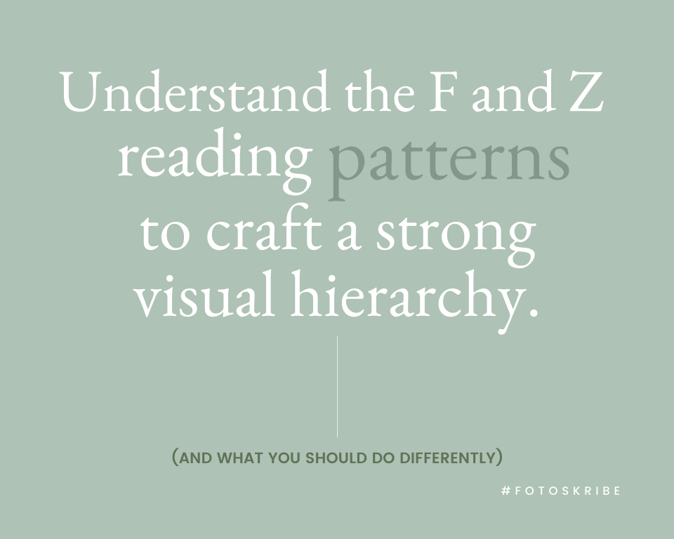
A. F Patterns
This reading pattern indicates that a reader often tends to look at a text-heavy design from left to right, going from top to bottom. This somewhat creates an F- or E-shaped pattern. This basically means that the topmost left corner of any page is the zone that gets the maximum attention. And therefore, you can observe that many websites tend to place some of their most important content on the top-left side of the web page – this includes the home page icon, about section, pricing, brand’s logo, etc.
B. Z Patterns
Corners indeed play a crucial role in visual hierarchy, and the Z pattern is a classic example of that. This reading pattern is applicable to pages that are not text-heavy and often display the content in a less densified manner. It states that for such pages, a viewer often starts scanning the page from the top-left corner, then goes horizontal towards the right-most corner, then takes a glance diagonally toward the bottom-left corner, and then again goes horizontal toward the right-most corner. Thus creating a Z-shaped reading pattern.
Suggested Read: Understanding the Silo Structure & How It Can Benefit Your Website
3. Color & Contrast
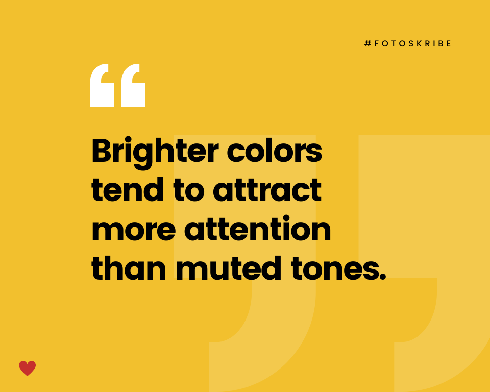
Color is another important element of the visual hierarchy. Why, you may ask? The answer is simple – brighter colors or shades tend to attract more attention than muted tones. Something designed with bright yellow or red tones is more likely to grab your attention faster than a text written in gray. That is why news tickers on your television screens often have red backgrounds. However, it is also important to be mindful of the background color of your design. Mixing high contrast warm color tones with cool tones can also yield striking results.
4. Spacing Matters
Just how it is often said that too much of anything is not good, similarly if your design is structured to stuff in too much content within a small space, chances are that your text will appear cluttered and crowded. And the result? A confusing design that might distract the viewer and fail to hold their attention for a longer span. On the other hand, strategically using white space around your text can easily help draw attention to it. Also, be mindful of the negative space and use it accordingly around your overall design to enhance the look and feel of your content by making them appear impactful.
5. Typeface
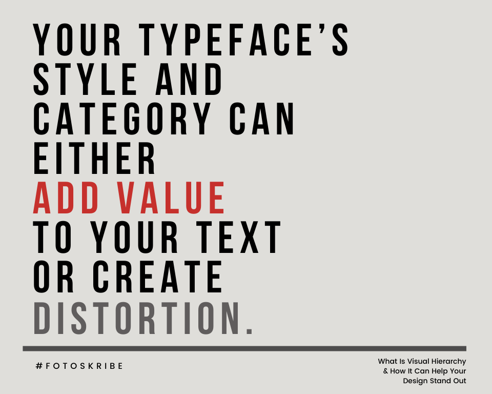
Would you type a job application in the Comic Sans font? Probably not (unless maybe you want to add an informal tone to your application)! These font-related details make up your typeface category and style – which also play integral roles in the visual hierarchy of a design. When we talk about typeface category, we are basically referring to serif, sans serif, monospaced, script, decorative, display, etc. On the contrary, typeface style could be bold, italic, etc. Your typeface speaks to the audience and sends out a specific message. Therefore, it is essential to carefully choose a particular typeface that conveys the required message. A specific font style can help you emphasize some elements of your design. Moreover, you need not follow the same style and category for the entire design. The trick lies in creating a balance so that every element of the text feels like a part of a cohesive whole.
Further Read: Understanding Pillar Content: A Complete Guide
Think of the visual flow of your website, graphic, design, or paper as an exercise of dressing it up well and making it presentable for your audience. When you dress up for an event, you possibly keep in mind the nature of the outing, you think of the color tones to complement the occasion, you accessorize yourself to pep up your look. Similarly, keep in mind the purpose of your design, the way you want to present it, and how to balance the design elements as per the visual hierarchy to make it all work as a cohesive unit. Most importantly, remember that it all comes down to a superlative user experience. And once you get these aspects right, you will be on your way to creating an eye-catching website or page design for your audience!
At Fotoskribe, we aim to help businesses like yours grow their online presence by delivering smart and meaningful content that engages your audience. And we do it in a way that gets Google’s attention.
For more information on how we can help – check out our pricing plans.